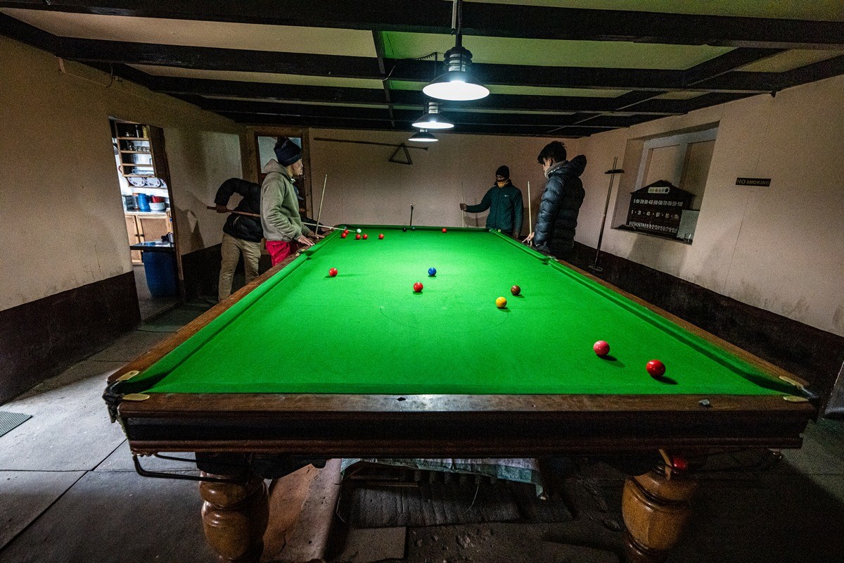
One of the cultural shocks on our trek up to the Base Camp of Mount Everest was our seeing a snooker hall/club practically every day in a village we passed through or stayed at – no matter how small the village! (Just in case you’re not sure what snooker is – it’s a cue sport, kind of like billiards or pool.) Even in Dingboche, some 4400 meters above sea-level, there was a “Sherpa’s Kitchen & Bar” with snooker! Extraordinary. So extraordinary that I just had to find out a little more about this unanticipated Nepalese “tradition”…
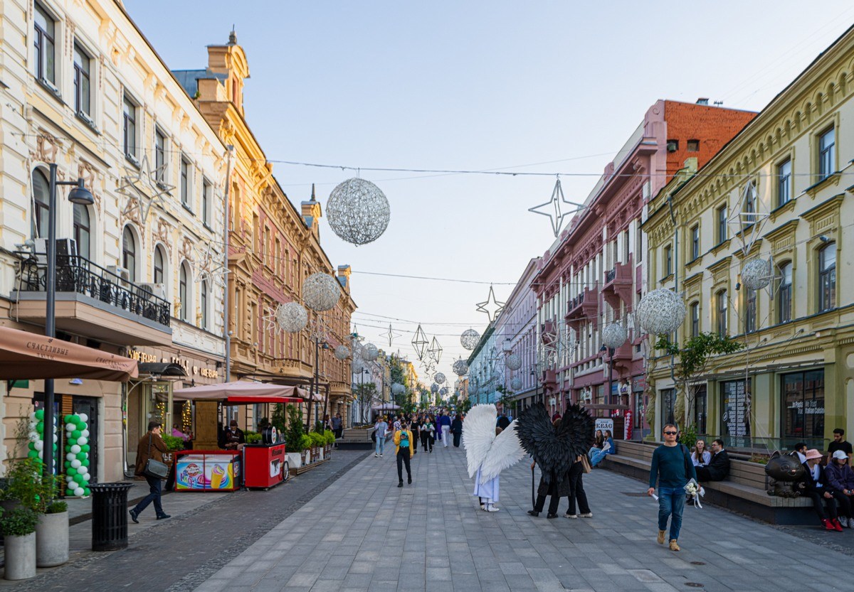
In all I saw four snooker-playing establishments on our trek. The first one was in Lukla, where we landed (at the world’s craziest airport), on its main street:
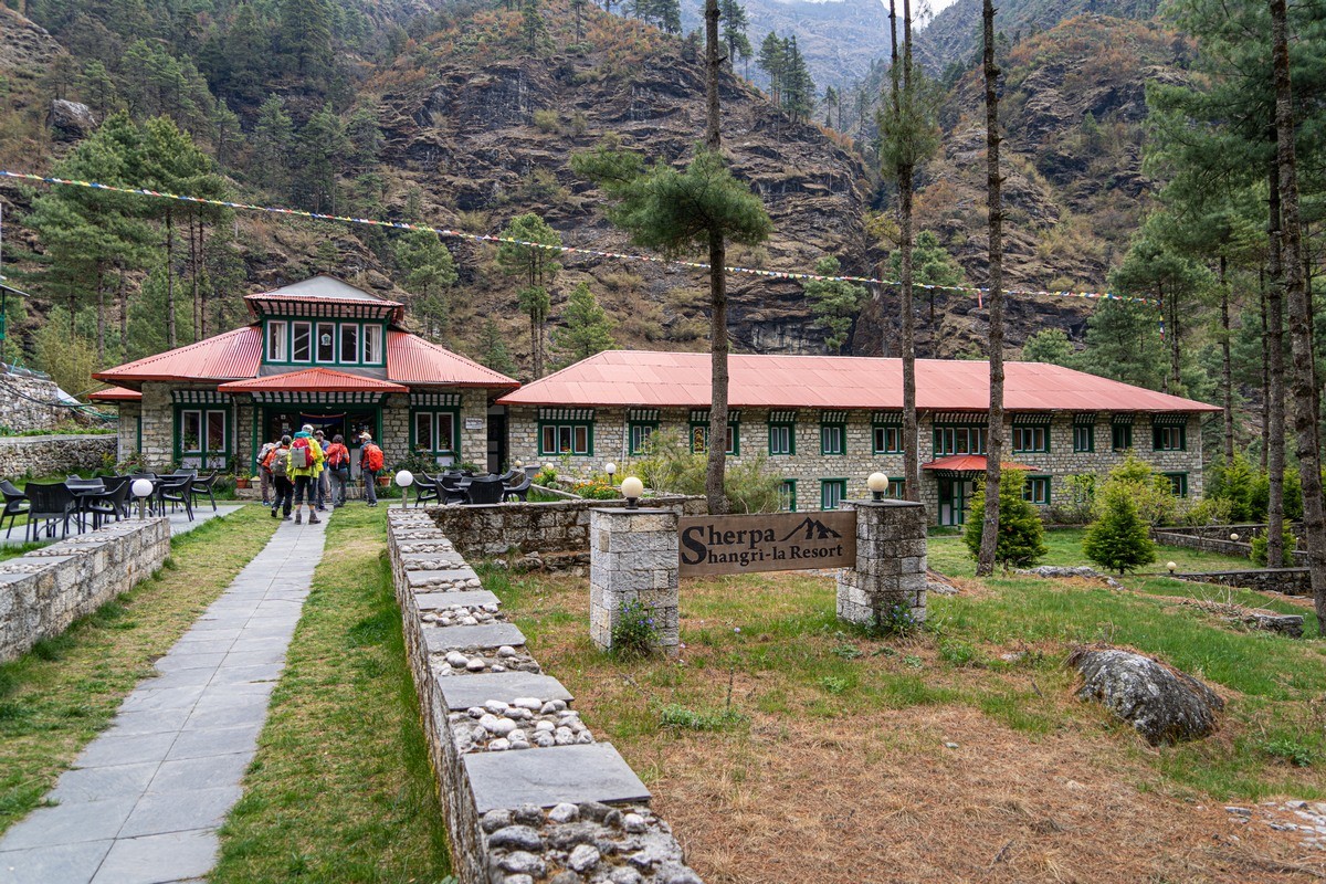
The second time was in a small village not far from Namche Bazaar – the same village as where the supposed scalp of the Yeti is exhibited (in a Buddhist monastery):
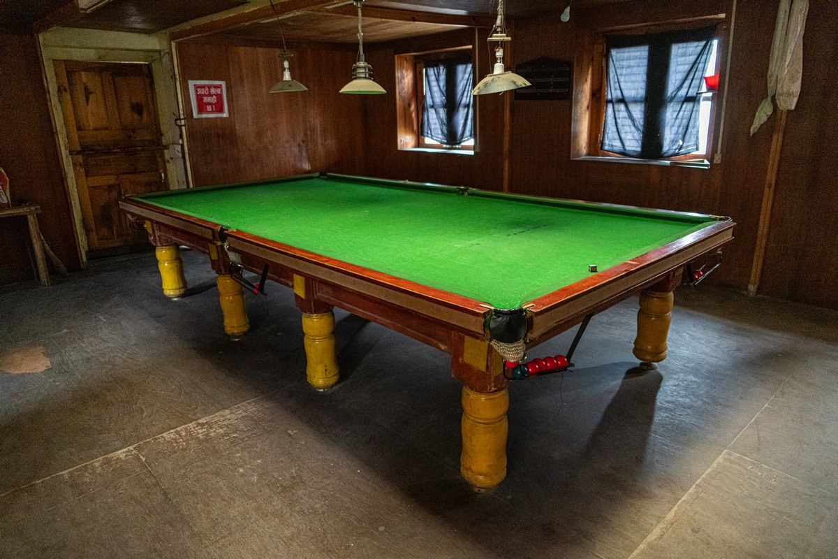
Still not quite believing my eyes, I decided to go check up on the presence of an actual snooker table inside. And there one was. Full size too…

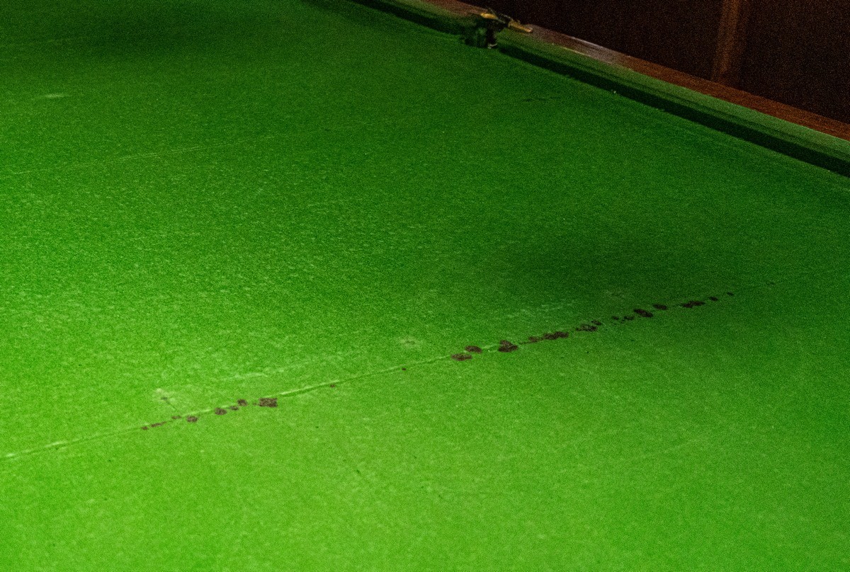
The green baize has seen better days, but it’s still perfectly usable:

// In Namche Bazaar itself I only saw a pool (not snooker) table (they’re smaller).
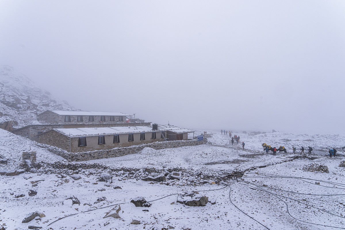
The next snooker hall we saw was in Pangboche. And that was at just under 4000 meters above sea-level ->
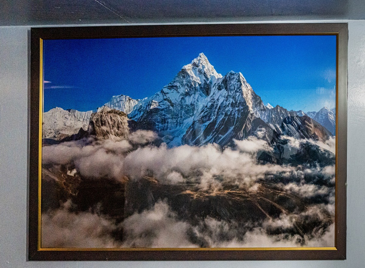
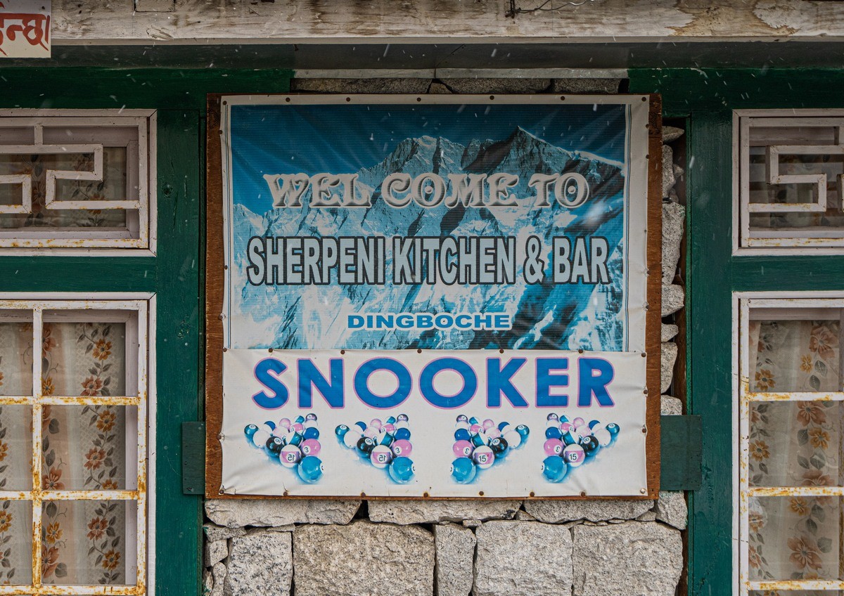
But the record was at 4400 meters in Dingboche – and as full-size and genuine and proper as all the rest!…

// Btw: what’s wrong in the above photo?
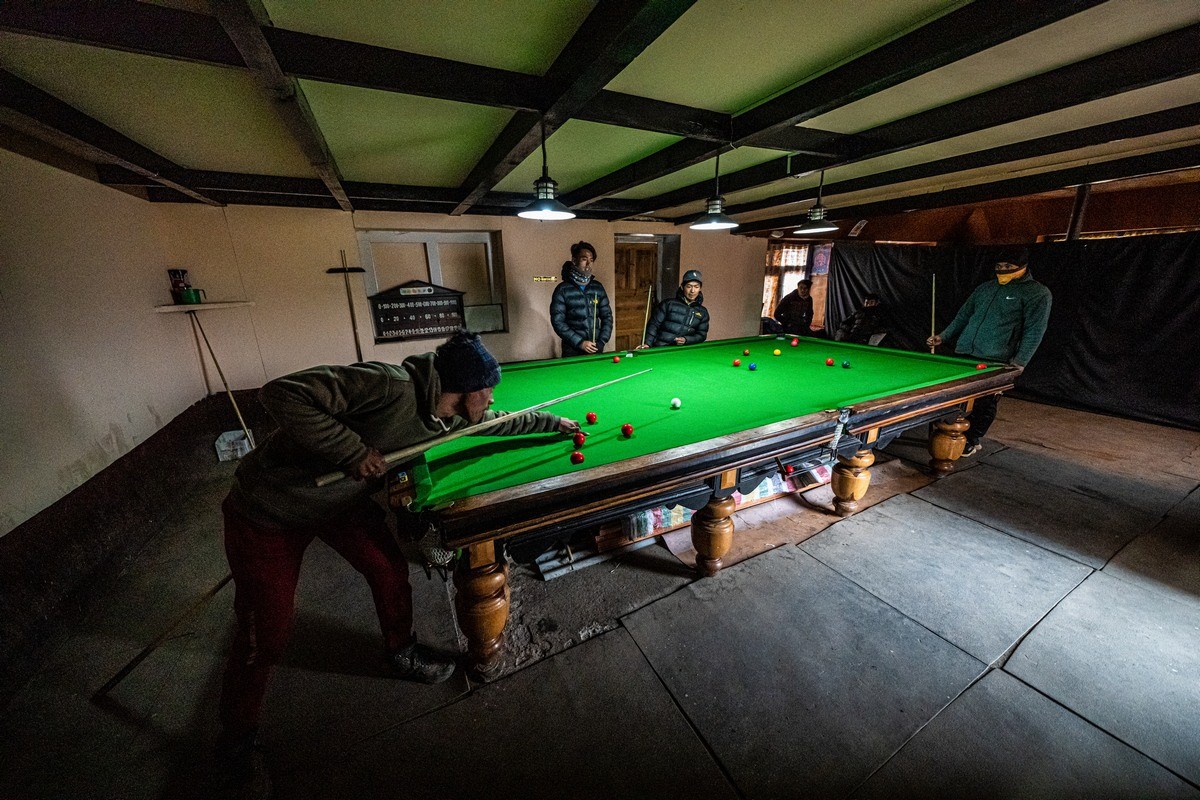
Sherpas in action:

And they turned out to be the Sherpas who’d just carried up our luggage and that of another group…

Remember – no transportation at all around here. Imagine the job they had getting this colossus all the way up here?!!
So, just how did snooker come to be so popular in the Nepalese mountains (and valleys, I guess). Some seem to think it’s down to the fact it was invented in next-door India by British Army officers in the mid-19th century; others reckon it’s only just gotten real big over the last ten years.
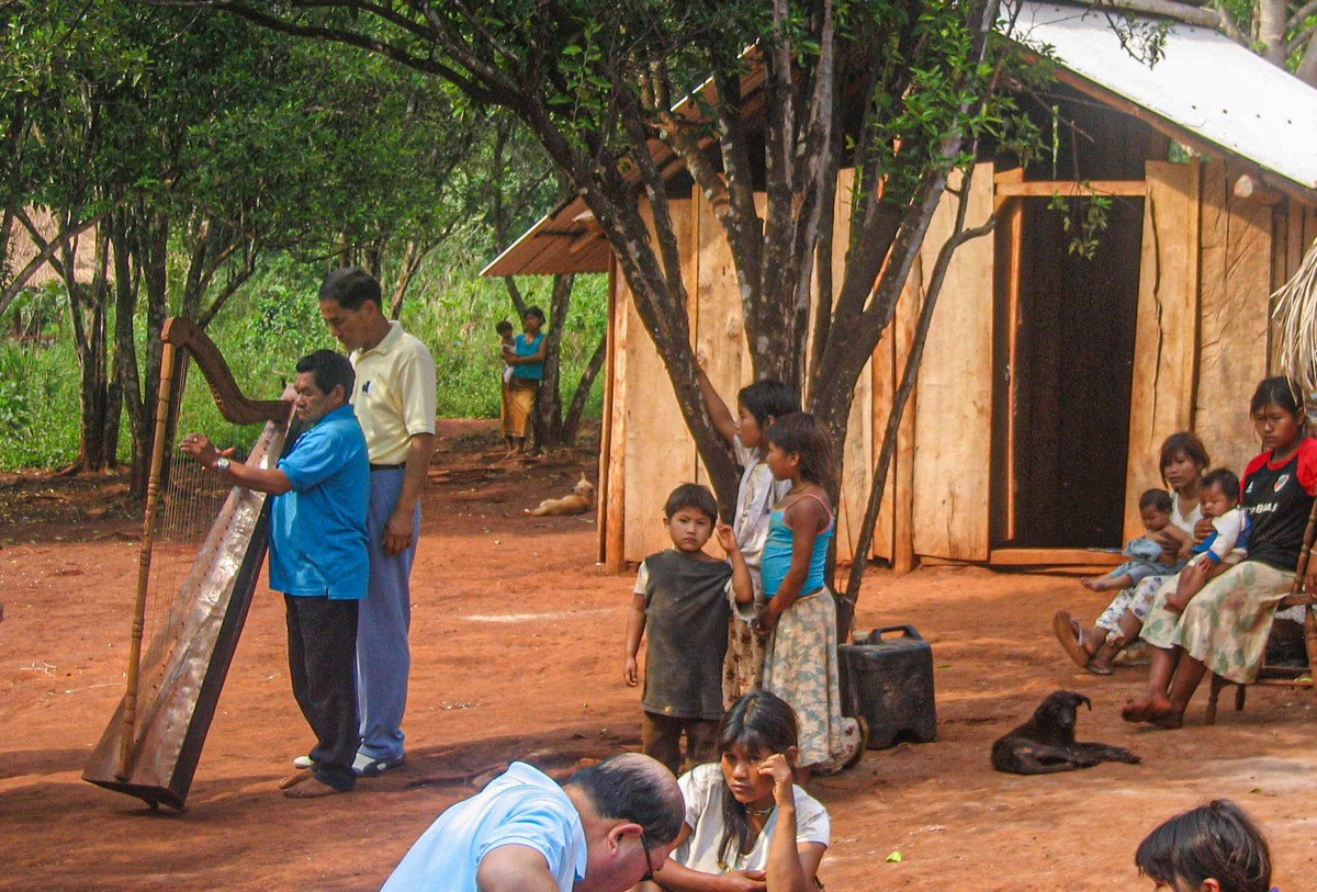
Sherpa-snooker in the Himalayas reminded me of another cultural shock in an indiginoius peoples’ village in Paraguay in 2006. Here are my travelogue notes from back then:
“Excursion along the Paraná River, which separates Paraguay from Argentina. Fun! We got out on the Paraguayan bank and were taken to a museum of an explorer. If lucky, you get taken a few kilometers further through jungle to a village of indigenous Paraguayans. Everything’s just like in the movies: short in height, traditional dress and body paintings, huts, lots of children, and… a soccer pitch! [that’s just the culture-shock hors d’oeuvres!] They offered to play music. We agreed they should; and out comes – a harp, which an elder proceeded to play eloquently! Culture shock! Guaraní + harp!”

And that’s all for today folks. Back in Nepal we were headed further – in an upward direction. But more on that later…
The rest of the photos from our trek up to the Base Camp of Mount Everest are here.
