July 8, 2021
Our rebranding story, and how Midori Kuma nearly became our logo.
Early June of 2019 was a quiet, nothing-special kind of early June. The world was rotating around the Sun as per, 19 days remained until the astronomical summer, ‘Corona’ meant a Mexican beer, and ‘covid’ meant absolutely nothing to anyone. In short, it was life as we knew it pre-pandemic: what we all could do with a lot more of today…
Meanwhile for the Kompany, we had our own schedules and timeframes, also as per. And early June, 25 months ago on our schedule was significant: it was when our big rebranding was taking place. The time had come for us to say goodbye to the old Korporate style (in terms of the logo, besides a whole lot of other stuff, including the fonts and other stylings and colorings and imagery, and what-have-you), which, given a few tweaks down the years, had been with us a full 22 years! It was out with the old and in with the new – a reboot, an upgrade, a Porsche, a rejuvenation, an image change; time for something different, more in line with the times, and also more polished; at least that’s what I was told (joke). No, really – it was to give us a new corporate style to more accurately reflect the company’s next stage of development – an ambitious yet confident stage, and certainly a futuristic one given our industry (cyber [the security thereof]).
But where others change their logo (slightly!) and have done with it, we had lots more in store. In fact, a full rebranding is a lengthy, complex process of tweaking perfecting all aspects of the identity and life of the company, including not only how we look on the outside, but also the way we interact with audiences, communication style, and scores of other things.
So yes; today’s post is all about rebranding. Now for some detail…
Work on our big rebranding began back in 2018. We’d known for a while how our good old logo/brand and messaging were more late-90s/early-2000s-oriented than 2019. For years we’d been sensing a certain dissonance between our technologies/products – which were always truly cutting-edge – and the image of the company to our users. For several years already we’d not been ‘just an antivirus company’ but a developer of broad-spectrum cybersecurity solutions. Yet still our logo was fairly antique with its pseudo-Greek letters. It was as if it was anchoring the company to the past – to the long-forgotten floppy-disk times.
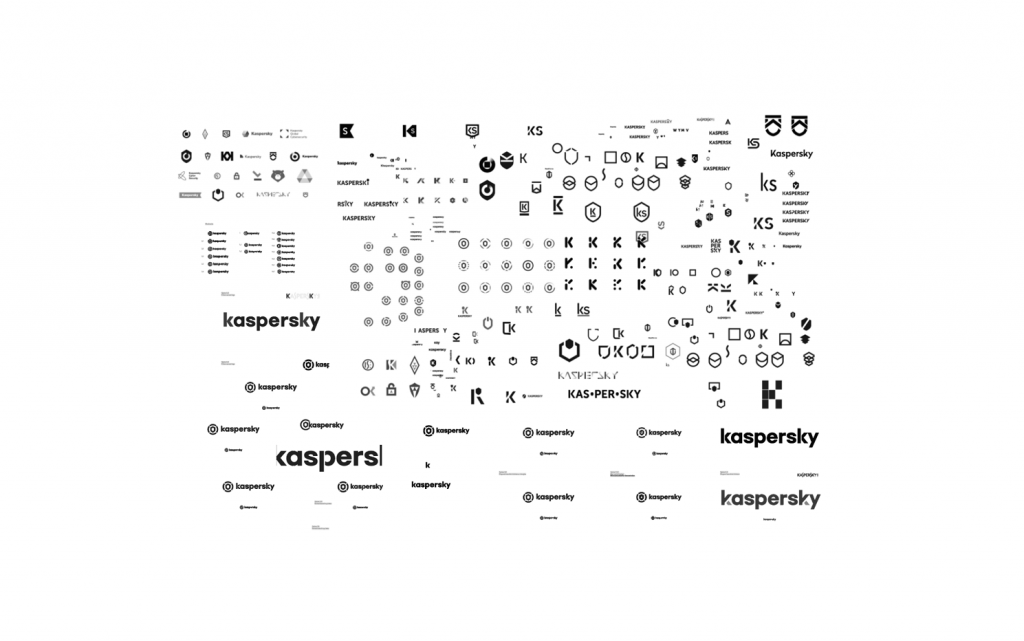
For nearly a year we brainstormed, thought, compared, imagined, weighed up, discussed, argued, consulted, agreed then disagreed, considered, debated, deliberated… all so as to find the very best perfect fit for our rebranding. A conservative estimate at the number of logo variants our design team put forward gives at least… 300! Then, the final couple of candidate-versions were vetoed be moi. Not because I was being obstinate, but because I was being super obstinate simply didn’t see even in those final few prototypes one that resonated 100% with the company’s aims and values.
Oh, and here are the rejected variants! ->
Some curious near-misses (hits?!) occurred during the year of debate…
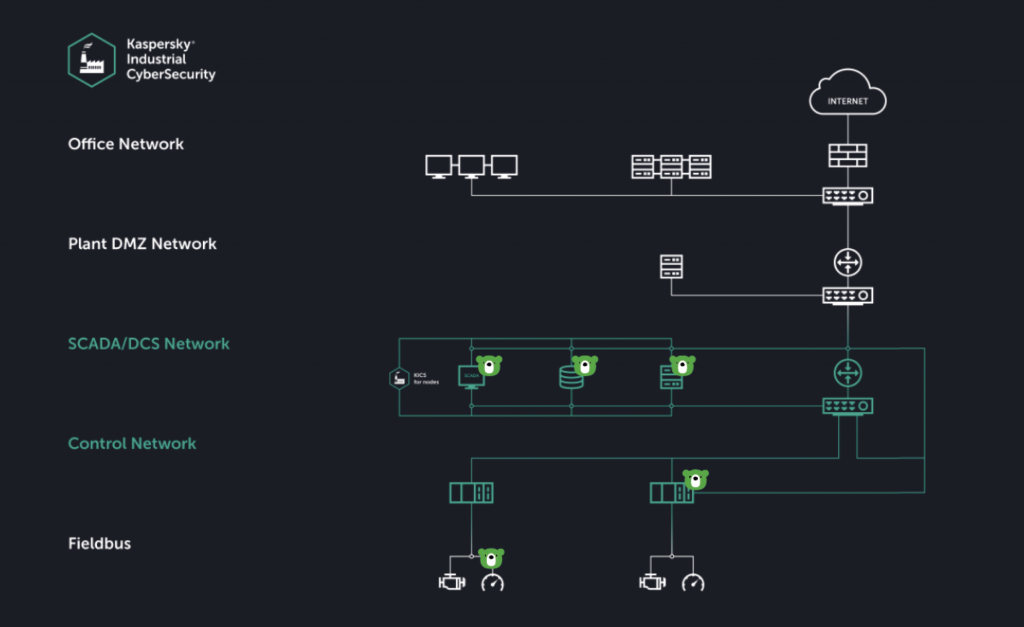
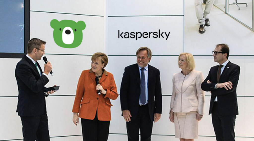
At one point I thought that perhaps our green bear – Midori Kuma – could be not just our mascot but also our logo. Mercifully, some wise K-folks showed me just how inappropriate a green bear would be at times. Here, for example, is how our business presentation on protecting industrial infrastructure would have looked ->
This is how meetings with very important and very famous people would have looked:
And on HQ’s roof we’d have this! ->
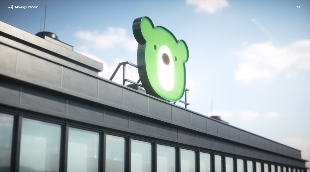
In principle it could have worked and been fun, but when you have a business as big and serious as ours you need to look a little more mature ). Not that Midori’s been ditched. He’s still around, but in small, carefully measured doses, only in certain places, and only in certain poses!
Then we invited a rather cool London-based agency to help us out. They developed several proto-concepts, one of which was finally chosen. It was the one with mathematical accuracy and engineering consistency as its basis that we went for: it just felt so right – perfect! A few more months passed while the prototype was fine-tuned, and then – finally – I gave the green light to the final-final version of our logo, incidentally at our Security Analyst Summit (SAS), which that year was held in Singapore.
So, on June 3, 2019, we upgraded our logo, announced the beginning of the era of ‘cyber immunity’, and I wrote this blogpost. But that’s no way ‘it’. That was just the beginning. Like I wrote above, rebranding is a lengthy process…
In modern marketing there’s a thing known as brand experience – how folks interact with a brand. In the simplest terms it’s all about the impressions a brand makes on users on all levels. And here it became clear that the new logo was only a basis; all the hard work lay ahead.
User interaction with a brand is made up of many stages – from first acquaintance to (maybe) saying goodbye (it can happen). With the logo we express that we’re friendly, straightforward and accessible – despite the complexity of the products; we also look after the user – despite the ‘cold’ sphere in which we work. But you can’t do everything with a logo alone. You need to get these messages to all points of contact with the user so that the brand is perceived as it was intended to be perceived on all levels.
And there’s no final end point in this process. It is the embodiment of the term ‘an ongoing process’. It’s a bit like the popular science idea that states that the human body completely regenerates itself every several… months, or is it years? It’s an oversimplification, but the metaphor’s a good one for present purposes. Human cells are indeed replaced in massive quantities, but at very uneven rates. Well it’s the same with rolling out a new brand at all levels: while a wave is still on its way to the furthest part of the system, it may already require adjustments in places where it’s been implemented. And that’s how it goes, in a constant cycle.
All the same, we can already see the first results! We regularly conduct marketing research to track changes to the image of the company and their effect in the eyes of users. And in the last two years the ‘innovativeness’ of the company has shot up from 45 to 51%! What’s especially pleasant is when users themselves, without prompting, utter the special phrases we’ve attached to the new image of the company. I’d kiss them all! Both users and our design wizards and wizardesses.
And talking of wizards and wizardesses… The coolness of our new brand has been recognized not only by users but also by the professional community. It earned the prestigious Red Dot Award in the Brands & Communication Design 2020 category. And recently we found out that our brand has been singled out in Russian university lectures as ‘on trend’. Here’s one example, from the Art and Design School of the Higher School of Economics! ->
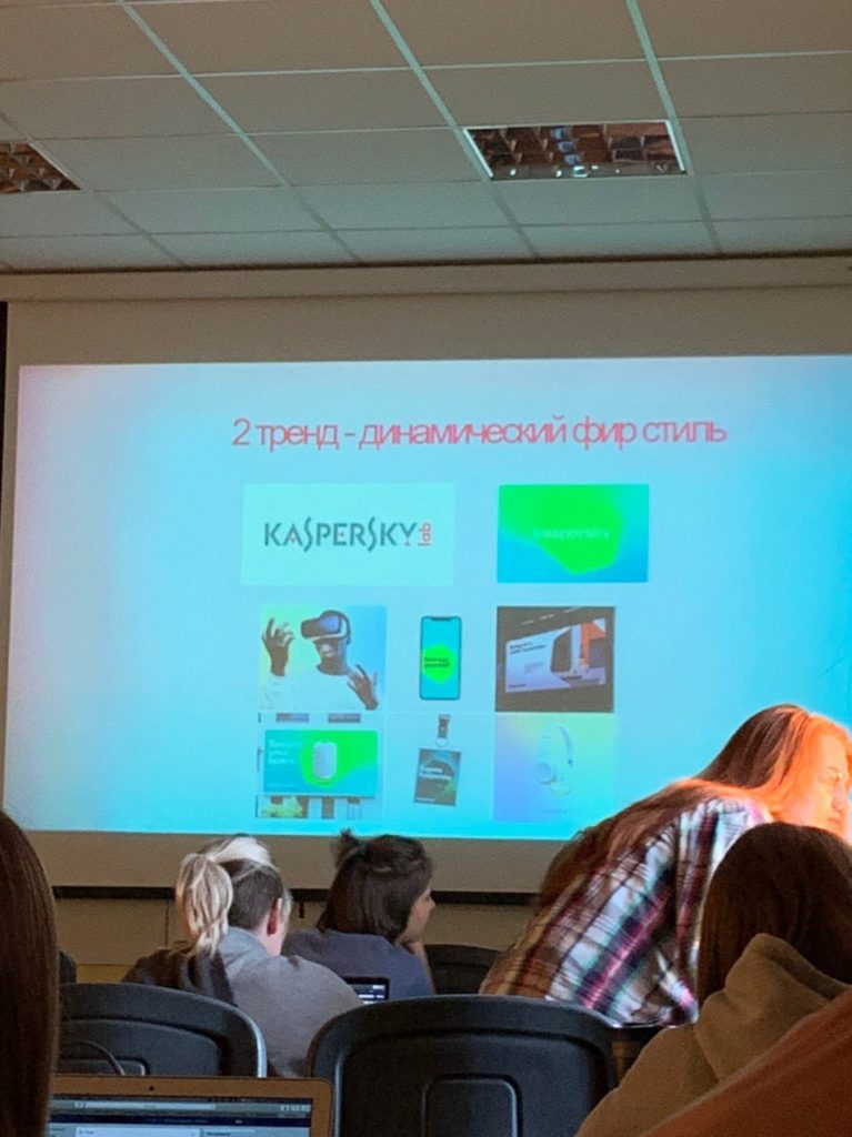
So, what am I getting at here? At the fact that we’re modernizing, contemporizing, becoming more accessible, and adapting to the times – adapting to the future! We’re becoming just as progressive in terms of branding and slickness as we always have been in terms of our world-beating technologies. And that, folks, is one formidable combination!

