June 27, 2011
A Blast from the Past. Part I – the Pack-shot Odyssey.
Kaspersky Lab has just turned 14 years old. On June 26, 1997, after eight years of perfecting our technology with my colleagues, we decided it was ready to go to the market, and so we registered a company. The first years were really hard for all the team members. The business was developing slowly (but surely) and sometimes it was difficult to make ends meet. But we never had a single moment of hesitation to want to stop and switch to faster money – despite the numerous temptations surrounding us at the time.
I remember Alexey De Mont De Rique and me standing at a tram stop one snowy day when in a flash I was overcome by some kind of irrational confidence that we would develop the world’s best anti-virus software. Call it a revelation, if you will. And yes, it was that simple, yet bold: the best anti-virus – head and shoulders above the competition on its detection rate. We never made money our target. We just played the game we really liked.
We started with absolutely nothing in 1991 – besides ambition, knowledge and confidence. Nobody knew us. Fast forward to the 2010 world market race, and Kaspersky Lab finished fourth in the overall ratings and third in the consumer market segment. We made great strides in both the retail and SMB markets, and have already started doing the same in the corporate market. Wish us luck in getting out front!
These last 14 years have resembled a thrilling roller-coaster ride of ups and downs. And on the occasion of our anniversary I thought it might be a good idea to take a trip down memory lane and give you some insight into our history: I will publish a series blast-from-the-past blog posts, starting with a historical overview of our retail product boxes.
If my memory serves me well, we have had at least 12 series of boxes. The first two didn’t get past the prototype stage – samples designed before we established the company. From 2006 we began introducing a new box design for each new version of our products, and we still do so every year.
Okay, let’s begin.

Up until the last minute before publishing this post I thought we had lost the very first box – that it hadn’t survived the company’s numerous office moves in the early years. But in the end, thankfully, we did track it down. The box was designed by Alexey De Mont De Rique in 1994 and featured the product’s name – Antiviral Toolkit Pro back then.
The second incarnation of the box was specially designed for the release of the long-awaited AVP version for Novell NetWare – a major network operating system at the time (I wonder how many people remember it?), which quickly lost the market to Windows and Unix in the early 2000s. Up until the last minute I thought we had lost this box forever too, “like tears in rain” © Blade Runner. However, our fans on the Kaspersky Lab forum helped us out in locating one – so we could have a look once again at the nice green, orange and purple leaves covering the box. But I still have no recollection whatsoever as to why we chose this color and pattern.
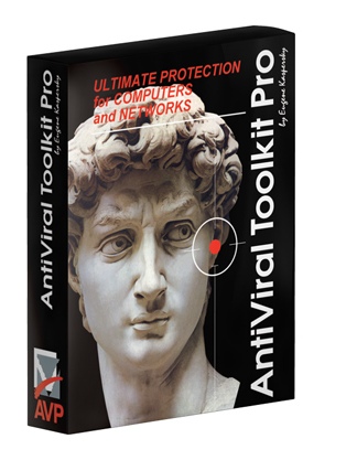
In 1997 we introduced a new retail box featuring the head of Michelangelo’s David – to support the official announcement of Kaspersky Lab being established. Though viruses were still a rare occurrence in those days (as were computers compared to now!), we decided that the story of David and Goliath from the Old Testament resembled perfectly the state of affairs on the malware battleground. Or was it some kind of anticipation of the fact that ten years later we would be discovering about 30,000 new malware samples per day? I’m not sure.
The “David” box held out for almost three years. Some of our more observant comedians used to joke that the photo on the box is the only one of me without a beard.
In mid-1999 we rebranded the box’s eye-catcher – starting the three-year long “umbrella era”. The first box featured a minimalistic design with a hand holding up an umbrella, with the area underneath it left blank (as in – completely protected from the rain) to emphasize the nature and quality of protection. The box for network-based anti-virus products featured a single umbrella with three hands holding it, which we thought both more appropriate and convincing for the corporate market.
Despite the company comprising barely 40 people and earning just $1 million in revenues, our marketing guys were extremely picky even back then in delivering the right message to the right target audience. We continued with the umbrella idea but changed its particular appearance several times. The standard black umbrella picture gave way to a cyber-umbrella in which some users discovered a hidden image of a syringe. Another significant (but nevertheless hard to spot) feature of the cyber-umbrella box was the adoption of a new product name and logo. Good-old AVP became Kaspersky Anti-Virus plus a number of auxiliary products like Kaspersky Anti-Hacker (a personal firewall) and Kaspersky Anti-Spam.
In 2002 we began searching for a new brand identity and ended up replacing the umbrella with regularly updated tech-style pictures resembling the nature of the products inside. First came boxes emphasizing the brand, followed by boxes emphasizing the products’ application.
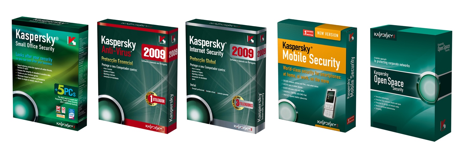
In 2006 we finally discovered a strong eye-catcher and selected a solid color scheme, which we have kept up till now. The choice of the color was rather natural as green rather neatly completed the vacant position in the anti-virus market’s traffic lights tricolor – bolstering our new motto: “Red for threats. Green for you.”
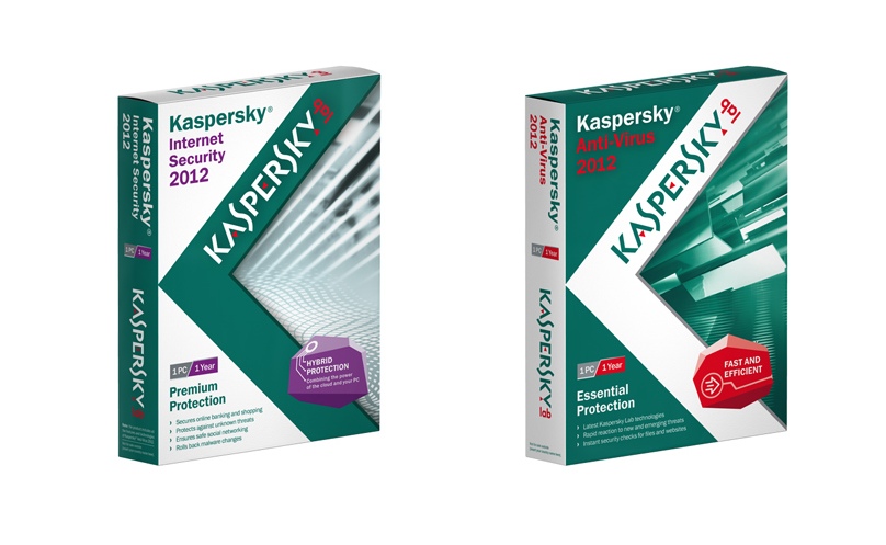
Following the tradition of introducing a new box design for each new product incarnation, the 2012 version (already launched in some regions, available soon in others) will feature a new look. After many years of using the famous “K” logo we gave it a major face lift.
Personally, I think the old appearance made more sense. The “K” consisted of a “V” (for “virus”) and a black arrow pointed downwards symbolizing the product’s capability for eradicating viruses. However, focus groups reported that this logic is not that easy to follow, and so our marketing guys developed a new concept.
Now the “K” sign covers the whole of the front and the left-hand side edge of the boxes: if you rotate the box horizontally anti-clockwise you can see the whole picture. The box looks great – both on the shelves and on the web. I especially like the nice glossy coating of selected areas, which adds extra appeal.
2007
2008
2009
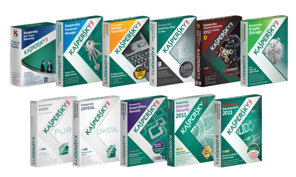
2010
2011
We’ve also had a number of boxes produced by our local offices and partners. You can find them on my Flickr account.
In the next post I will cover Kaspersky Anti-Virus’ prototype, which was developed in the early 90s: A nostalgic trip back to the DOS era, with interesting text graphics and old-school terminology.
Anyone know the name of the prototype?
Here’s a tip: AVP is the wrong answer.


